
EZRA ALWAYS WINES
VISUAL IDENTITY & BRAND GUIDELINES
Ezra Always Wines is the vision of sommelier Ezra Paganelli, who brings people together through tastings and education. From the start, our goal was to design a brand identity that feels as inviting and dynamic as the experiences themselves.

CHALLENGE
The challenge was to create an identity that positioned Ezra Always Wines as approachable and playful, while still grounded in expertise. Unlike traditional wine branding, which often leans on heritage and formality, this brand needed to feel accessible without losing credibility.

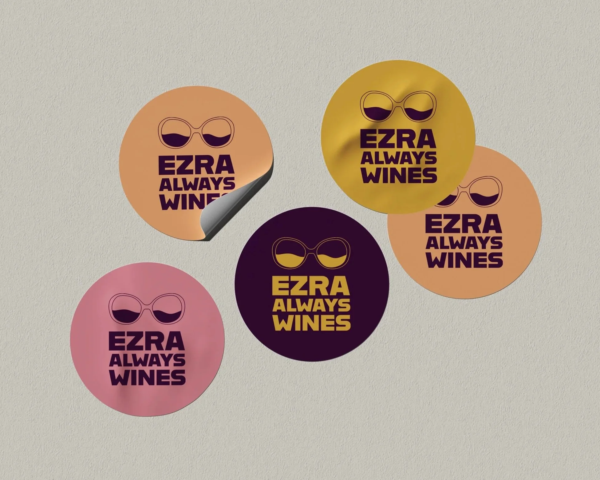
LOGO & COLOR
The logo features Ezra’s signature glasses, with wine swirling in the lenses, inviting us to see the world of wine from a new perspective. The playful nature of the logo captures the brand’s unique and joyful approach to wine education, tastings and discovery. The color palette builds on that idea, showcasing bold and saturated tones that mirror the range of hues seen in a wine glass. Together these elements, create a look that feels confident, modern, and true to the experience of learning from Ezra.


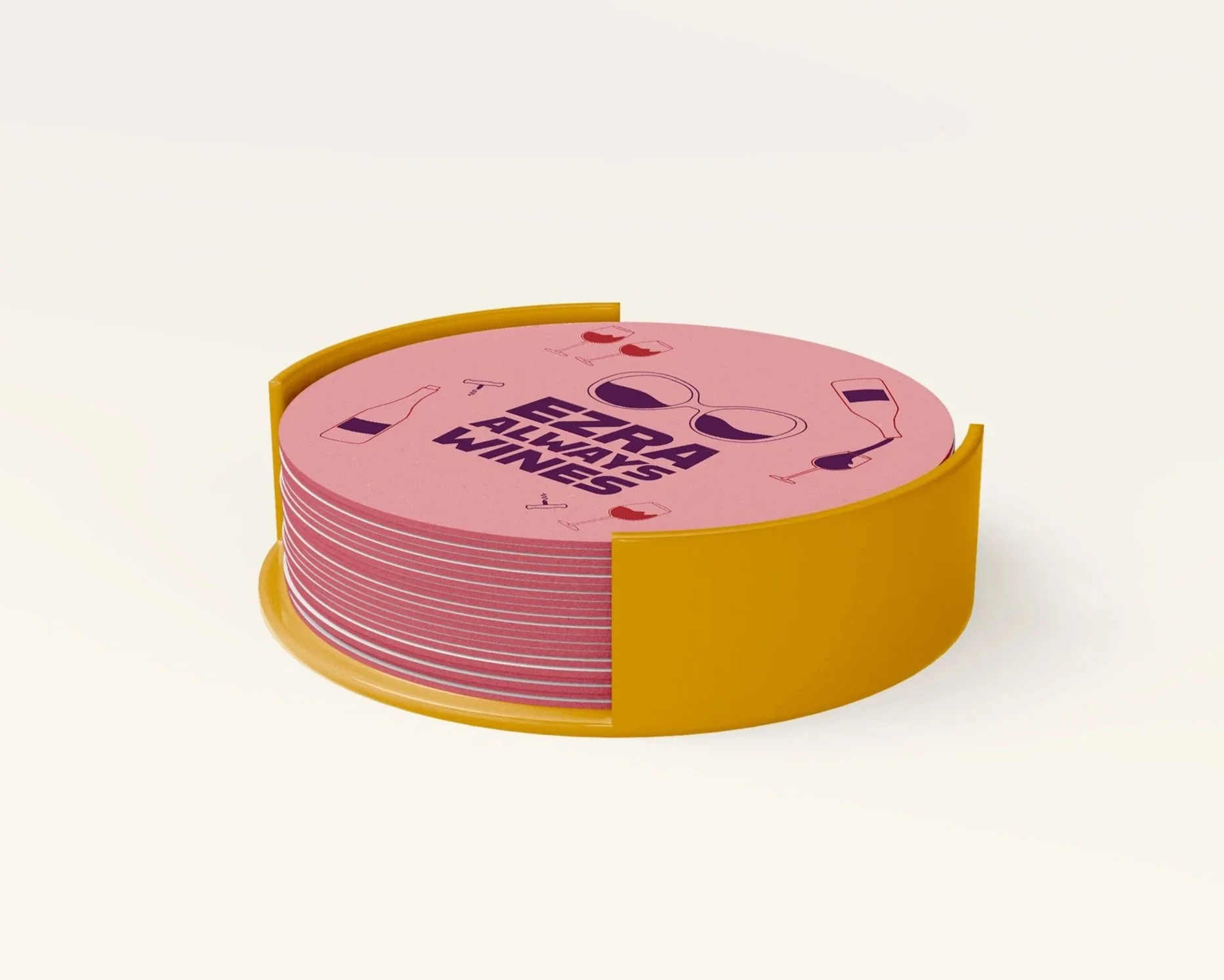
TYPOGRAPHY & ICONS
Typography choices were made with clarity and approachability in mind. A clean, modern sans-serif keeps information easy to read across tasting sheets, digital materials, and much more. Supporting icons extend this language, offering visual cues that help organize information while incorporating the brand’s playfulness.

CHARACTER & PATTERNS
At the heart of the brand is Ezra himself, whose personality and passion shape every visual decision. He is not just the face of the brand but its character, representing curiosity, warmth, and an approachable form of expertise. Patterns and illustrations were designed to extend this identity across every touchpoint.


